There is no second chance to create a good first impression so they say and it applies to property as well as people. It is known as ‘kerb appeal’ on the TV home programmes and in the case of one Keswick home, in particular, it began at the front door.
The original, badly fitting door was the first thing that interior designers Maureen and Louie Whitemore knew had to go before they even stepped over the threshold. It offered the opportunity to create something unique and for that they turned to Kendal-based glass designer Jo Vincent who created bespoke panels reflecting the local fell landscape around Keswick.
“They say that the front of a house is like its face and it is important to make it warm and welcoming to smile at your visitors. And you too, of course, every time you come home,” says Maureen.


Although the house represented a small project compared to some she and daughter Louie work on, it was no less an assignment. “A lot of ingenuity was required,” she explains. “It was a rather dated holiday house that had had much of its original details removed, but we knew there was plenty of potential.
“Working alongside local cabinet maker Luke Harding, of MOS furniture, Lattimers builders, Kendal Quality Carpets and lots of other Cumbrian businesses, and with clients who wanted something just a little different, is always a pleasure and it was a great opportunity to transform the house into a practical, cosy warm and spacious home with lots of storage.”
Behind the front door, a second inner door was removed to create a more spacious entrance with a bespoke coat and shoe area. “Inner doors were originally used to keep out the draughts, but with the new weather- and draught-proof front door it was no longer needed. Removing it also meant we could use the extra space, with Luke creating a fitted, new unit which also integrates the rather ugly electrics and meter cupboard often seen in the hall in this type of house.”

For practicality, an inset doormat in Forbo Coral was laid along with Amtico flooring along the extent of the traditional, narrow hallway.
“The addition of a large mirror bounces the light around, adds to the feeling of space and reflects the light from the directional downlighters placed to one side of the hall ceiling. This has the effect of making the hall look wider rather than a line down the centre of the hall,” adds Maureen.
So far, so straightforward, but the next step was more ambitious. A hole was knocked into the left-hand wall from the entrance with glazing set into the bespoke, shelved timber frame. This helps to draw light into the hall from the sitting room which has a large bay window and has the effect of opening up the hallway. “You may need Building Regulations approval for this type of work and the glass will probably need to be fire rated,” says Maureen. “Rather than looking at a single large sheet of glass though, Luke cleverly framed out both sides of the unit creating shelves on the sitting room side.

“The asymmetric positioning of this and the mirror works well with the coat fitment on one side, again adding to the look and feeling of space.”
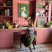
In the sitting room, the reproduction yellow pine fireplace looked clumsy and heavy so it was painted in a shade darker than the walls. “This has the effect of almost reducing them in size. The rather ugly multi coloured tiles within the fireplace were painted with special heat resistant paint black giving a much more subtle look rather than a feature which would have been difficult to work into the scheme.”
The freestanding television in the corner was incorporated into a fitted unit to give maximum space in the room and to provide more storage.

“For the window treatment the modern slatted shutters, pole and curtains were removed and replaced with a double layer of blinds. The under layer is a simple textured privacy blind and the top layer is a roman blind in a soft woven stripe by Jane Churchill,” says Maureen. A final dash of colour was added in the cushions on the client’s existing sofa. “We even made new coordinating lampshades to bring the original lamps up to date. The room looks so much more spacious now.”
Originally the living area is likely to have been two separate rooms but at some stage the dividing wall was removed to create an open plan space with the dining area at the far end. Transforming the space meant finding ways to bring in more light.
“New French doors replaced the single sash opening onto a small yard area at the back and are a welcome addition to bring the outside in on warm days. To add a little elegance, curtains and a Bradley curtain pole were used, rather than blinds, with a coordinating fabric to work with the blinds in the bay window at the opposite end of the room. “This also helps to give each space a slightly different identity,” explains Maureen.

“The fireplace was painted the same here as in the living area. The unusual ceramic wall lights from Astro Lighting cast beautiful patterns and work well with the bone china lights from BTC hanging lights over the client’s original dining table, and the chairs. An adaptable lighting design was a high priority on the client’s wish list.”
The dining area leads through to the new kitchen. The building originally had a badly built, single skin kitchen extension which was cold, both physically and visually, the designers discovered. There was a bathroom above on the first floor and a garage/store at the far end of the kitchen that led out onto a back lane. It was agreed that it all had to go. Maureen explains: “The major part of the renovation included demolishing this whole section and re-building to a high specification both in insulation and building terms and in décor and practicality. Given the size of the area we decided to use sliding pocket doors in these areas, which are a good space-saver, and put in electrically controlled Velux skylights for extra light.

“The client wanted a fun, colourful kitchen, a utility area and a downstairs cloakroom that would make you smile. Now, looking through into the kitchen, it surprises you. With its mix of end grain plywood and laminate, it is far from standard.” Spring green and lemon were chosen for the colour scheme.
“To help give the illusion of more space, we took the breakfast bar table into the window reveal to integrate it into the windowsill for a neat and practical finish. We used the same idea on the sink and worktop, extending the Silestone into the window reveal.
“Large porcelain tiles from Alexander and Sancto, in Kendal, on the floor help to keep the area looking less cluttered and create the feeling of space; small tiles visually make a space feel smaller.”
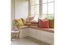
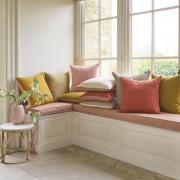
Roman blinds in soft tones give a homely feel as well as warmth and privacy when lowered at night

A new, matching utility area was created with practical tiles used as a splashback. In a small home, every corner has to earn its keep and in this case Maureen and Louie identified space in the utility room near the back door into which Luke made a corner seat. Its coordinating padded cushion provides a comfortable perch on which to pull on or take off boots.
Underfloor heating and well insulated floors and walls, together with the colour and lighting scheme, make the space warm and welcoming as well as practical.
“The cloakroom is small,” admits Maureen, “but with the neat sink, pocket door and fabulous wallpaper by Mairi Helena it definitely fits the brief. “The lower section of water-resistant tongue and groove was painted to match the colourful kitchen cabinets and to continue the uncluttered look in the kitchen, Jo Vincent made a wonderful, clear glass landscape panel in three sections. The wall behind was painted in the same green as the woodwork making a wonderful, subtle and very practical splashback.”

Upstairs, the main criteria for the new family bathroom from the client was a modern look with a great shower and storage.
“A hinged shower screen allows ease of access to a wet room shower,” explains Maureen. “It has a tailormade, shallow former tray beneath the tiles to prevent water from travelling. This type of shower is perfect for ease of access and preventing a trip hazard.” Tiles by Villeroy and Boch complement the ceramic wood floor and botanical feature wall panels to complete the look.
Two small shelves in the shower neatly contain his and her toiletries with a hidden secret. “The bottom section includes a gadget with a rubber blade. Used on the glass screen after every shower it prevents the build up of limescale and means the screen rarely needs to be cleaned. A wonderful bonus,” says Maureen.
A large drawer unit beneath the sink provides storage for all other bathroom necessities. All the fittings were supplied by Carvetii Interiors, of Carlisle.

The next priority in the scheme was the third, smallest bedroom which is only used for occasional visitors. “We worked together with Luke to make the most of the space whilst giving guests a touch of luxury and sufficient storage for a few days stay. The bespoke unit utilises a recess so the wardrobe space does not encroach on the room, which of course means that the hanging rail is front to back, not something I recommend for everyday living but is perfect for short stays.
“It also has two large drawers and an area at the bottom to place empty travelling bags – what luxury to be able to unpack and not trip over a bag during a stay.
“The wardrobe is combined with a wall-mounted dressing table and bedside tables with sockets for recharging phones and wall mounted reading lights. All of this creates a feeling of space and makes hoovering and cleaning easier too.


Moving into the master bedroom, the fitted furniture was again made by Luke to save space and provide significant storage.
First, the builder extended the width of the chimney breast to make it a little wider than the king size bed which is positioned against it. “In most small houses of this era the bed is wider than the chimney breast which then makes it difficult for a headboard on a more modern wider bed to fit neatly,” explains Maureen. “It is not a good look and often leaves any bedside furniture in limbo. By fitting the headboard to the wall and making bespoke, fitted, bedside storage units, the whole scheme works perfectly.
“Wall mounted reading lights make bedside lamps defunct in this case, although both can be used; one for the purpose of reading and the other as a decorative addition or for even more light.”

Soft colour schemes in Little Greene Paint Company’s slaked lime were used in several rooms in different intensities or tints giving a sense of flow and cohesion. Two coordinating fabrics by Romo were used for the blind and headboard.
Onto the second floor, a poorly designed and very cold shower room needed attention. “Insulated walls, new Velux windows and underfloor heating addressed the cold problem, and a complete redesign transformed this room into a wonderful, attractive and functional shower room, again with lots of storage.
“As the joists were old and prone to a little movement, we installed a shallow shower tray rather than a wet room shower and Amtico floor tiles. Ceramic tiles from Alexander and Sancto were used on the remaining walls. We used a made to measure mirror across the gap between the Silestone worktop and start of the angled ceiling with a light strip along the upper edge to give a soft and gentle light and, again, a feeling of space and luxury.”

The drawback in the large and airy top floor bedroom was the low angle of the ceiling, which made it difficult to have a large sized bed and to fit standard wardrobes and furniture. To address this, Luke made a low bed base to fit a standard king size mattress making it a little easier to edge around the bottom of the bed.
The large headboard with sockets, USB ports and reading lights has an upholstered centre section for comfort. The fabrics for the bed, cushions and bench seat were from a range by Mark Alexander.
Maureen adds: “Another problem with attic bedrooms are dormer windows. It is not easy to provide a cover for an area with so many angles, especially if you cannot sleep with light intrusion.

“Our way of providing cover in these circumstances is to employ fitted angle shutters that can be closed at night to each side and to install a blackout centre roller blind. There will be some light seepage, but it is undoubtedly the neatest way of dealing with this shape of window. During the day the slats of the shutters can be angled for maximum light.”
Smaller properties have no less potential as stylish, practical and rewarding homes than their bigger counterparts, but maximising space and light does require more skill.
Maureen adds: “It is always exciting to see the finished product of many months or sometimes years of work on a project and we are thrilled with the transformation of this terraced cottage. The best bit of all is to see the joy it has brought to our lovely clients.”