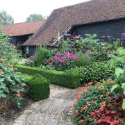
Welcome to a charming English country garden. A garden bursting with floaty florals, traditional details and wild imagination. A comforting and familiar place, so quintessentially English that it could have been lifted from the pages of an Enid Blyton novel.
The cottagecore style of this garden tugs at the heart of our cultural heritage. It conjures the magical places of fairy tales and stories of youthful adventure where childhood imagination mingled with nature. Games of hide-and-seek in the bushes and sword (or stick) fights amongst the flowerbeds. Followed by picnics on the lawn with slices of cake and lashings of ginger beer.
There’s even a secret gateway at the rear leading to the woods. Where no doubt, daring adventures await involving den building and pirates.
Yet here and there, amongst the traditional, there are touches of modern design. Alluding to a much more intriguing plot. But as someone once said in another very well-known English tale, let us “Begin at the beginning”.
The beginning
When Earth Designs first visited this site the garden was tired and worn. The long, narrow plot ambled from the back of the house to a summerhouse at the rear. It sloped over three levels, joined by an overgrown path and steps that rose at intervals. There was no consideration of the available light or space in the layout. In essence, the garden lacked imagination, organisation and flow.
Planting consisted of large shrubs that dominated the borders. But many of these had overgrown their welcome, becoming unwieldy and overbearing. As a result, there was plenty of foliage and greenery, but the planting lacked variety, colour and floral softness.

Cottage garden dreams
The clients on this project dreamed of a traditional English cottage garden that made better use of the sunshine and space. They wanted places to grow their own produce and spaces to relax at the end of the day.
Working within the confines of the narrow and uneven plot would be a challenge. Earth Designs needed to introduce texture and intrigue, as well as make the space inviting and less linear. The lead garden designer Katrina, went looking for inspiration - and found it in some unlikely, modern sources.

Modern inspiration
When commissioned to design a garden, Kat often looks to the art and design world for inspiration. Between projects, she can often be found wandering the halls of art museums and galleries. Gathering ideas for interesting details and potential layouts from paintings, furniture and fashion. For this design, inspiration came from modernist furniture designer Eileen Gray.
The cascading drawers of her famous Cabinet d’Architecte provide inspiration for the new garden layout. And a creative solution to introducing texture to the elongated nature of the plot.
'I was drawn to the way the squares and rectangles of the drawers fitted perfectly together. Each one has its own distinct shape, but together they create a new and exciting form full of texture and discovery.'
The influence of the modernist master, Dutch painter Theo von Doesburg, the founder of the De Stijl movement is also evident. Kat cites the interlocking rectangles of his painting ‘Composition XX’ as another source of inspiration.
'I loved the way the shapes neatly slotted together,' said Kat. 'In isolation they are so simple, but together they create a completely new experience.'
Taking both of these influences on board, Kat reimagined the garden layout into a series of tidy rectangles. Sections of lawn, stone and wood overlap to create a satisfying procession of
spaces. Each one has its use, from potting shed to patio. Every space, its own world, but also a stepping-stone onto the next, where new discoveries await.

Introducing intrigue and delight
As you enter the world of the garden from the house a porcelain patio is the first world you enter. Perfectly placed to make the most of the sun, with room for al fresco dining and a pergola overhead for those steaming hot mid-summer days.
Next you encounter a lawn, with a potting shed marking the far boundary. Its own little perky three-dimensional rectangle added to the mix. But although the shapes are linear, they aren't stark or unyielding. Beds and corrugated steel planters stuffed with tall flowering plants smudge the edges. Their blooms floating in lacey swathes around the patio and lawns, adding movement, romance and a cottage garden feel. The smart slate grey troughs make a nod to old English farmyards, but their clean urban finish adds a modern twist. While a stoneware water feature brings another element of the English countryside to life. The gentle bubbling fountain sends the sounds of a babbling brook tinkling through the garden.
The new planting palette meanders around purple, pink, white and lime green. This repeats throughout the garden, creating harmony and softness. But as requested by the client, this is a growing garden as well as a pretty one. Which means in addition to the potting shed a few of the corrugated planters are reserved for vegetables. Squashes and tomatoes tumbling over the edges, looking ripe for the picking and perfect for summer picnics.

The happy ending
With the redesign of the layout, the staccato of the slope has been tamed. Now only one noticeable level change remains as you near the end of the garden. This adds a sense of dramaand expectation as you step up into the final chapter of this country garden story - and the ending doesn’t disappoint.
Beyond the final archway lies a magic carpet of colourful flowers. Pretty ground cover plants run in rivers between porcelain plank stepping stones. From this tiny world between worlds a pathway leads to a final patio outside the summer house. Here we find the ideal spot to end the day, and our garden tale. Because all good stories, like good gardens, “Begin at the beginning” and “go on till you come to the end: then stop.“
The End.
Award-winning Earth Designs are members of the British Association of Landscape Industries and the Association of Professional Landscapers.
info@earthdesigns.co.uk 01702 597587


