The multi-award-winning designer Kelly Hoppen is famous for her signature neutral palette – taupes, beiges, blacks and creams, greys and whites – which have graced some of the most famous celebrity homes and hotels in the world.
“Whether it’s in Middle East, America or Asia, each one is very different, and it’s exciting,” highlights Hoppen.
With a wide array of projects on the go, she says it’s about understanding the philosophy of how people live, what your client wants, and then creating a story.
“So it’s not just a bedroom. It’s creating a backdrop, like in a theatre.” She continues, “My job is to create the backdrop for people to live.”
Today, at 65, with a career spanning 47 years, having conquered the world of luxurious interiors, she’s launching an exclusive home design collaboration with Marks & Spencer.
“I’m beside myself,” enthuses Hoppen. “It’s about to be seen, having worked on it for a year-and-a-half in secret, which is not easy for a Leo!”

Hoppen reveals it’s been a lot of work, with four more collections under way. “I’m really happy about it, and something I’ve wanted to do for a long time. The price range is fantastic, and the quality is good.”
She continues: “When you get to know someone, you’re designing something; or if you’re doing a hotel room, you’re imagining how people will use it.
“So it’s got to be practical, but it’s got to be ‘the dream’. It’s got to have lovely textures so you melt into them… there are so many different layers and factors.”
Influenced by luxury living, within the 75-piece collection she describes as “affordable”, Hoppen wanted to create something “with beautiful bedding, cushions, vases, lighting, throws, curtains and small pieces of furniture – with all the accessories that go with it.”
“It’s about making people’s home feel luxurious in their own way. Everybody wants to have a beautiful home, but to have affordable luxury was something that I felt wasn’t really out there.”

As well as numerous decos inspired by clean lines and curves for a timelessly elegant look, in true five-star hotel style, a high level of comfort is part of the aesthetic.
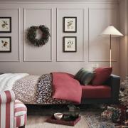
“When people think about their bedrooms, the bed is the largest piece of furniture. So if you can dress the bed and make it look beautiful with lovely, soft fabrics, that’s half the battle in a bedroom.”
Then you can look at your lighting, suggests Hoppen. Maybe do a feature wall behind the bed, or reupholster your headboard, and then she says it’s all the little bits you put with it.
“Whether it’s a little candle holder to one of the vases, or a beautiful glass vase dish, or whatever’s in the collection that catches your eye.”
“I always say accessorising your home is like putting your jewellery on when you get dressed… it’s jewellery for the home.”

“So you’ve done your bed, you’ve got your lovely throw, you’ve got your cushions, you’ve got your art up, then you need some hard texture.
“It’s the same with cooking. You’re adding different tastes to create that stew you’re making. It’s not just the chicken with tomato.
“I know it’s a weird way of looking at it, but it’s the same when you’re creating a home, it’s a recipe, and you just keep adding things – and the different textures will make it feel much warmer.”
And with her confidence-boosting, best-selling interior books to help create a Hoppen home of your own, are these part of the hardware to make everything feel balanced?
“I always say to people, books are literally your best friend when you’re trying to accessorise.

“On a coffee table, people get scared of what to put on them. If you’ve got a pile of books, put a candle so it’s slightly higher.”
She says you can then place a vase to the left. “Which is slightly lower, so it’s different heights on a coffee table. But as my partner says, you need to leave enough space to put a drink or cup of coffee.”
Visually gorgeous, curvaceous vases feature among the M&S collection – with floral arrangements part of her signature style. “For me, any flowers are nice, just as long as they are one colour.”
With meticulous attention to detail, black and white photography is one of Hoppen’s passions. A case in point, she’ll soon be doing a masterclass on Instagram demonstrating how to frame and hang them.
“Every mount should be white or cream, or grey or black, depending on the look or feel of your room, but I would go for white.”

“But if you’ve got a wall, say, across from your bed, you could do a collage of different sizes; or it could be pictures of your family or kids.
“It’s the way it’s framed that’s important, so every frame should be the same.”
The new M&S x Kelly Hoppen exclusive homeware design range is available in M&S stores and online at marksandspencer.com


